Introduction – A Bold Move After 10 Years
After a decade of familiarity, Google has decided to change its iconic “G” logo — a move that has caught the attention of millions across the world. In 2025, the tech giant is rolling out a redesigned version of the “G” icon that has been synonymous with the company’s global digital presence.
This change is more than just a logo update. It marks a turning point in Google’s design philosophy, branding strategy, and its alignment with a more immersive, AI-driven digital future. But why now? And what does this new symbol represent?
Let’s dive into a detailed breakdown of the redesign and what it means for the future of branding, tech evolution, and user interaction.
Why Google Decided to Change Its Icon in 2025
Evolution of the Brand Identity
Brand identity is a living concept, especially in tech. Google’s previous “G” icon, introduced in 2015, symbolized a multi-colored, minimalist approach aligned with its mobile-first ecosystem. However, with the rise of artificial intelligence, immersive interfaces, and advanced branding needs, the old icon began to feel outdated.
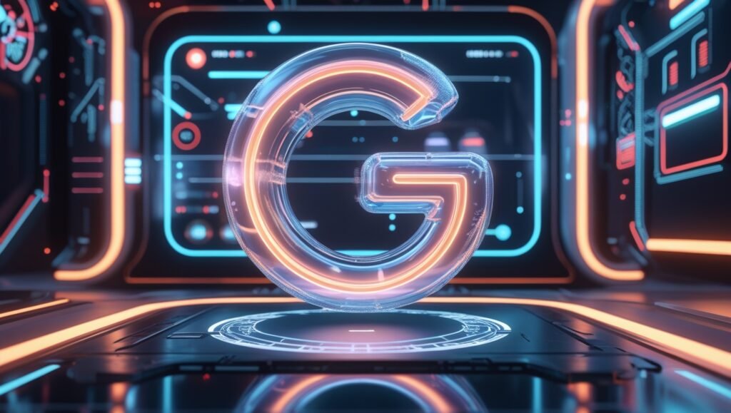
The new “G” represents a dynamic identity — bold, modern, and future-ready.
Shifting Toward AI and Ambient Computing
Google’s ecosystem has evolved far beyond search engines. With the emergence of Google Gemini, Bard AI, smart home integrations, and Android ecosystem expansion, the company needed a design that visually communicates intelligence, simplicity, and adaptability.
This change is a visual step toward a post-keyboard, post-screen world, where branding must live across AR, VR, and voice-first experiences.
A Closer Look at the New Google ‘G’ Icon
Design Philosophy – What’s New?
The new “G” icon takes inspiration from fluid, adaptive design principles. While it retains the familiar color palette (blue, red, yellow, and green), the font weight, curvature, and spacing have all been updated for a sleeker look.
Some key updates include:
-
A more symmetrical design that improves scalability on small screens and wearable devices.
-
Subtle gradients that adapt well to dark and light modes.
-
Streamlined edges that appear futuristic and clean in immersive AR environments.
Typography and Geometry
The typography has shifted toward Google’s custom Product Sans typeface, redesigned with more curvature and improved spatial balance. This makes the logo not only modern but also accessible across platforms, from wrist-sized smartwatches to 8K smart TVs.
The Role of User Feedback in the Redesign
Community and UX Testing
Over the past few years, Google conducted extensive A/B testing and user feedback surveys. Internal reports revealed that users were more likely to trust interfaces with cleaner, simpler logos — especially in mobile and wearable environments.
By integrating user feedback, Google has ensured the icon feels fresh, yet familiar — striking a perfect balance between legacy and innovation.
The Icon’s Function Across Google Services
Google Workspace and the ‘G’ Identity
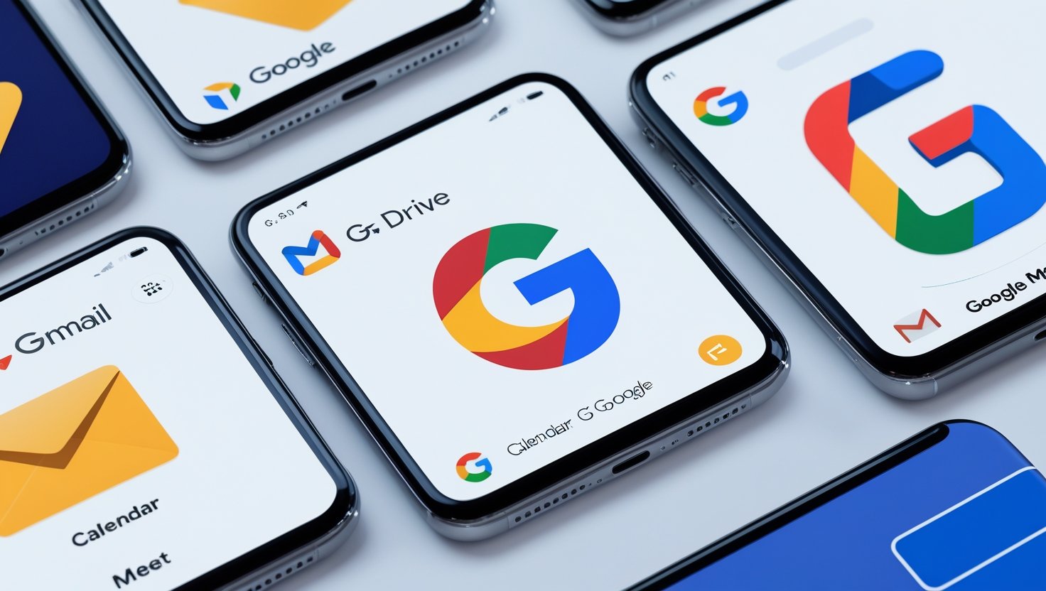
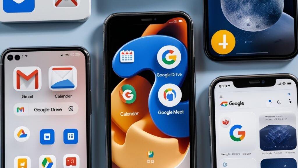
The new logo will first roll out across Google Workspace apps like Gmail, Docs, Drive, Meet, and Calendar. Each app will now carry a design language inspired by the new “G,” promoting uniformity and clarity.
Impact on Android and Pixel Devices
Android 15 and the Pixel 9 series are expected to debut with this new branding, reinforcing Google’s visual identity across both software and hardware. The unified design language is aimed at creating a more cohesive user experience.
SEO, Branding, and Market Strategy Behind the Move
Strengthening Search Engine Trust
Believe it or not, even a simple logo can influence search behavior. A new design gives Google a marketing refresh, reinforcing user trust and engagement in a competitive AI-driven ecosystem.
SEO experts believe this visual change aligns with a deeper shift in how Google is positioning itself — not just as a search engine, but as an AI-first, platform-driven company.
Competing with Apple and Microsoft
With Apple making bold design moves (like their rumored all-glass iPhone), and Microsoft rebranding its AI systems (like Copilot), Google’s logo update positions it to stay competitive and top-of-mind in the fast-evolving tech market.
Reactions from the Tech Community
Designers and Developers Respond
While some designers praised the redesign for its minimalist elegance, others felt the change was too subtle. However, the consensus is that the new logo is more future-compatible, especially for apps, wearables, and AI assistants.
Brand Analysts Weigh In
Branding experts suggest that this shift may be the beginning of a broader visual overhaul at Google — potentially even leading to redesigned icons for YouTube, Google Maps, and more.
Visual Transformation Timeline
Timeline of Google’s Logo Evolution
| Year | Logo Description | Key Change |
|---|---|---|
| 1998 | First beta logo | Serif type, multi-color |
| 2010 | More refined, shadow added | Added dimension and weight |
| 2015 | Flat Product Sans logo | Introduced current “G” design |
| 2025 | Redesigned “G” icon | Smoother, future-ready version |
The Future of Brand Icons in a Post-AI World
Logos Are No Longer Static
As AR/VR devices and ambient computing expand, brands need logos that move, morph, and respond to context. Google’s update isn’t just a new symbol—it’s a living icon that will evolve across devices and modes.
Preparing for a Multi-Device World
From foldables and tablets to AI glasses, users are consuming content across various form factors. Google’s new icon is optimized to scale perfectly and remain legible, no matter the device.
How Google’s Redesign Affects Other Brands
Many tech companies take cues from Google’s branding strategy. The new icon could set off a chain reaction — prompting other giants like Meta, Amazon, and Adobe to rethink their logos for the AI-first world.
Keywords to Watch in 2025 Design Trends
To understand why Google made this move, look at some 2025 design trends that are reshaping how tech brands build identity:
-
AI-first branding
-
Fluid typography
-
Responsive design logos
-
Ambient adaptability
-
Accessibility-first design
-
Multi-platform coherence
Final Thoughts – A Logo for the Next Decade
Google’s redesign of the “G” icon may seem like a small visual tweak on the surface. But beneath it lies a strategic repositioning for the AI-powered, immersive, and highly adaptive future of tech.
With this move, Google isn’t just changing its logo — it’s redefining how we interact with technology visually.
This new identity reflects Google’s ongoing commitment to innovation, simplicity, and user-first design. And while users may take a moment to adjust, this new “G” is destined to become just as iconic as the one it replaces.


Leave a Reply